

Neuromeditation Institute
Presenting Heart and Mind
The timing for our work with the Neuromeditation Institute would turn out to be fortuitous: the bulk of it manifested in a website that launched on the cusp of the shut-down for COVID-19.
We were first hired by the Eugene-based organization to develop a marketing plan. As with any marketing planning effort, we began by assessing the current situation and identifying the client’s goals. Next, we triaged the efforts.
The website came first because the Neuromeditation Institute already worked globally but hoped to do more training online and less in person. A hectic travel schedule was proving to be a distraction from the work the team loved most. That hope prompted us to focus on the website: We knew that if the site was solid, we could point digital campaigns there, building a targeted client base. But the original site was difficult to find online and once on the site, the offerings were part of a complicated web of programs that made sense to those already familiar to the group and the concept of neuromeditation, but to newcomers, it presented a frustrating navigation experience.

We had plenty of content – tens of pages and multiple websites – to work with. The organization already provided a range of online training and virtual reality offerings centered on using neurologic biofeedback for mental health. You just had to know where to look. You also had to be able to sort through a scientific presentation that was perfect for the group’s original academically oriented users, but was overwhelming if you were simple looking to access the power of meditation. That prompted a full rebranding, including a logo.
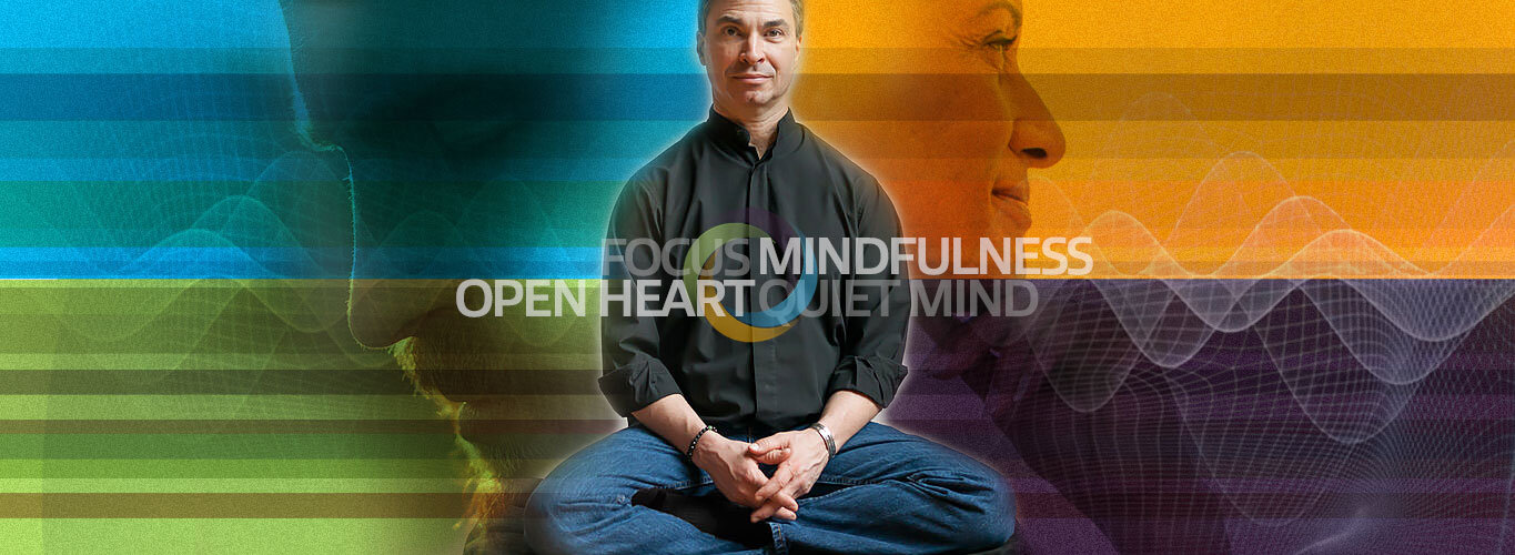
The previous logo was a literal interpretation of the activity of the mind. It succeeded in indicating an organization based in science and dealing with the mind. But it failed to represent the outcome of the organization's work: to unite mind, body and soul. The new logo grew from the infinite motion of a circle, united by four bands, or threads, of color that represent the four styles of neuromeditation: 1) focus, 2) mindfulness, 3) open heart and 4) quiet mind. (The Neuromeditation Institute provides various tools and trainings, but all of them focus on one of the four categories.) The logo was first developed as a fixed logo, but we realized that it would almost always be used electronically, so we animated it to better show progress and unity.


Dr. Jeff Tarrant and Dr. Erika Patterson founded the Neuromeditation Institute and were closely involved in the entire process. Their help was invaluable; Dr. Tarrant brought a technical view and endless energy and Dr. Patterson brought a solid sense of client needs and a calm approach to the work. The entire Verb team worked on the project, from defining the difficult into familiar words, to representing abstract concepts through accessible imagery. The website programming was custom, and set up to allow full client control through an admin panel.
The new website and more welcoming look and feel helped the client move smoothly into the post-COVID world; one that called for a site and training structure that we had no idea would become the exclusive access point for this intelligent and inspiring organization and its users.